
For our digipak we decided to use Adobe Phototshop CS5.5 to edit our images and put them together. This worked out really well as most of us already had a lot of experience working with photoshop.
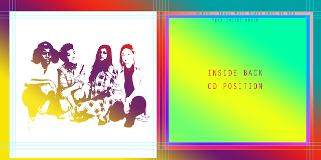
We worked with a digipak template shown below.

- The green area was allocated to the photo
- The blue area was allocated for any text spillovers
- The red line was the 'bleed line' - anything in that area would get cut off during printing
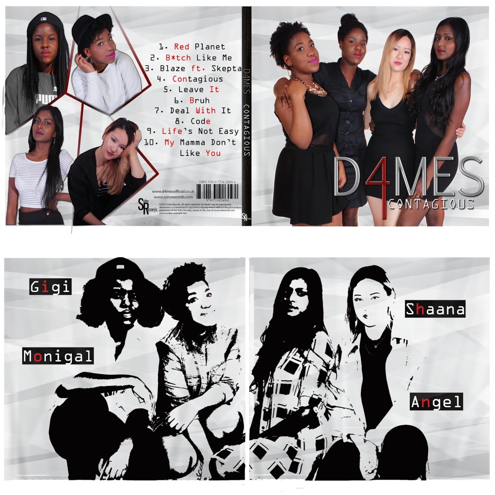
This is a picture of our original flatplan which consisted of us standing against a brick wall and one of the inside covers being an arty geometric design.


Me and Thakshana editing
The hard part was choosing which photos we wanted to use which resulted in our digipak process being very long due to much experimentation.
We wanted to used the photo below at first as we really liked our outfits however the pose did not seem quite right or bold enough for the front cover. We wanted something that made more of a statement.


We wanted to used the photo below at first as we really liked our outfits however the pose did not seem quite right or bold enough for the front cover. We wanted something that made more of a statement.
Thus we changed it to the photo below as it has the professional, classy girl group image that we wanted to portray.
The process of editing our digipak:
1. Using the selection tool and the magic wand we removed any backgrounds.
2. We used the define edge tool to remove any white edged and rough edges around us for example around our hair.
3. We increased or decreased the size of our image using 'show transform' option and placed the image where we wanted it.
4. We would crop anything we didn't want out.

Positive Feedback:
"I like the consistent colour scheme it's classic but the red keeps it interesting"
"I like what you've done with making some letters red"
Criticisms:
"The background of your inside cover is not nice, it looks very grunge and moody, I don't feel the rnb or pop vibe"
"The inside image of you all looks very washed out so you kind of blend in with the background"
"There's quite a lot of space around you on the front cover, you girls need to fill up more of the frame"
We agreed with the criticisms so decided to improvise and make some changes. Below is me and Thakshana's drafted result of our research on cool Photoshop effects. We wanted to create an inside cover that contrasted the front and made a statement.

No comments:
Post a Comment