Group 3 - Music Video

Group 3 - Digipak

Group 3 - Digipak
Our Digipack, top left - back, top right - front, bottom left - inside panel, bottom right - inside panel (CD)
This is a link to our website, click the image above to enter our site

Wednesday 6 January 2016

Evaluation Post 1: In what ways does your media product use, develop or challenge forms and conventions of real media products?

Our music video and marketing campaign follows many forms and conventions of real pop, street and rnb media products. To best connote our genre and image we closely followed the examples of real music videos that strongly reflected the urban street genre.

MUSIC VIDEO
For our music video conventions we followed many theories one of which was Simon Frith's.
Simon Frith believed that music videos came in three types:
Our music video fits into the performance category as it features a girl group who sing and dance. We take up most of the screen time. Most scenes are performance based shots such as our dance routine, singing to the audience, playing around and performing with male actors. We decided to do something interesting and not just conform to one category of music video but to make a hybrid music video. Our video displays aspects of the narrative genre as the lyrics and scenes with our partners convey small individual stories of how each of our relationships are like with our guys. This is similar to real media texts such as Fifth Harmony's Worth It and Little Mix's Move and even with Misery Business by Paramore (our prelim project). We included male actors to widen our audience appeal as they are for our viewers to gaze at and/or aspire to become like.

Goodwin also states that there is a "clear relationship between lyrics and visuals" which can be amplification, illustrative or contradictory. Our music video both amplifies and illustrates. Our song is called Red Planet and that line is sung quite a few times in the actual song. Therefore we wanted to use a red colour scheme as it signifies love and passion which fits perfectly with our song. Below you can see that in a few short seconds of our video, most scenes have a red colour scheme.
One convention of real media products we use and challenge is the the representation of females and the female body. Andrew Goodwin states that: "There is likely to be voyeurism, particularly in the treatment of women" in music videos. This has been a feature of  a lot of mainstream music videos driven by the idea that women's bodies sell. Music videos which sexualise women include Katy Perry's California Girls and Can't Remember to Forget You by Shakira ft. Rihanna. (right)

We've followed Goodwin's theory to target mass audiences but have also tried to challenge this by not over-sexualising ourselves as female stars and also by sexualising the boys more. This comes across in our lyrics which are quite sexual, but commanding and not submissive. For example lines such as "Give me all of your love tonight". We are also seen pushing away our guys and being playful with them but are never involved in sexual activity on screen.

Another theory we use and challenge is Mulvey's theory on the male gaze. She believes that audiences have to view characters from the perspective of a heterosexual male. The camera lingers on the curves of a female body and relegates women to the status of objects. Thus female viewers must experience the narrative secondarily by identification with the male. The male gaze theory applies to many music videos. We've used it by adding conventional beauty shots of each member of the girl group.
Our music video conforms very much to pop and rnb music video conventions. The sound of our song and and the beat are very pop - it includes the guitar, electronic beats and vocals. Our band identity is very street- this is portrayed by our outfits and the way we act and perform in our music video. Monica has a rapper's swag, her movements are tomboyish and explosive. Her facial expressions are fierce. Gift has a Beyonce-like sass and is very outgoing and confident. She smiles brightly and laughs a lot. Thakshana is girly as she plays with her hair and gets up close and personal with her guy but also very hip and cool as she uses a lot of hand gestures inspired by many rappers. Her facial expressions are casual but confident. I come across as a casual girly type as I also like to play around with my hair and dance in a more feminine style. Me and Thakshana try to create a more sexualised image with the way we dance and look at our guys and also the camera.

We are seen dancing, singing and performing with guys in our video which is very conventional. Our relationships with our guys come across as cute because we're doing random things such as Monica putting a hat on Will. Other times we create a more deeper sexual aspect as Thakshana's face comes really close to Aaron's. This gives our audience a varied experience with fun visual hooks as well as more mature visual hooks. We tried to create visual hooks with editing effects and content such as beauty shots of the girls and narrative shots of a girl and guy getting really close. Each visual hook grabs the audiences attention and also appeals to specific audiences in our target audience group.

CAMERWORK & FRAMING
Our camerawork is rarely static as we like the extra movement our shots create especially when we are dancing, the camera movement keeps the visuals more interesting and dynamic.
We tried to create visual hooks with editing effects and content such as beauty shots of the girls and narrative shots of a girl and guy getting really close. Each visual hook grabs the audiences attention and also appeals to specific audiences in our target audience group.

Tuesday 5 January 2016

Evaluation Post 2: How effective is the combination of your main product and ancillary texts?

Like other artists' marketing campaigns, we made sure our main product and ancillary texts worked in synergy to promote our band and music.

One way in which our combination of texts markets D4MES effectively is through the consistent band identity conveyed.

Richard Dyer's star theory states:
  • 'A star is an image, not a real person, that is constructed (as any other aspect of fiction is) out of a range of materials (eg advertising, magazines etc as well as films [music]).'
  • 'Stars are commodities produced and consumed on the strength of their meanings.'
  • 'Stars represent shared cultural values and attitudes, and promote a certain ideology.'
We created pop star images that are similar to our actual identities so that everything is synergistic and consistent including our poses, facial expressions, personality and how we speak as these things would all be noticed and closely watched by fans and viewers. However star theory means it is just a representation which meant we could be creative with how we wanted to present our complete image in order to target our audience.

Example of a real marketing campaign

Our marketing campaign
How the three texts are synergistic and link together, work together: branding (font), band image (street, London, girl power), genre (pop, RnB)
Our brand logo is clear and consistent. It is also shown on our website. All our fonts are white with some red letters to follow through with our red black and white colour scheme. However our album cover contrasts with our website in that it has a light grey background rather than a black one. We feel this contrast is a nice change rather than a stark contrast that seems out of place. Also our dressy black attire shows our prestige, classy side which ties in with connotations of both celebrities who attend classy events as well as the normal girl image who likes to go out and fun fun clubbing with friends.


Monday 4 January 2016

Evaluation Post 3: What have you learned from your audience feedback?

Our target audience consists mainly of young girls and women as we are a girl band promoting female empowerment. We also target fans of the rnb and pop music genres as our style of music is a combination of the two genres.


This includes young people of all ethnicities and genders.


We targeted our audiences using Blumer and Katz's Uses and Gratifications Theory which states the 4 simple needs of a media consumer:
  • Diversion: entertainment and escape from everyday life problems
  • Personal relationships: using media for emotional and other interation
  • Personality identity: finding yourself reflected in texts, learning behaviours and values
  • Surveillance: sourcing information from texts that is useful for life/living
DIVERSION
Because our video is performance based it is naturally a source of entertainment. Singing and dancing with cool lighting, effects and non linear editing will create a clubby, fun atmosphere that hooks the audience engaging them to watch the whole video.
PERSONAL RELATIONSHIPS
Our other media texts such as our Instagram and our website allows viewers and fans to know us as individuals better. It gives them an idea of what our friendship group is like and what we get up to everyday as normal people. Therefore we try to connect with our target audiences on a deeper emotional level and set an example of a close-knit, successful fun friendship group pursuing their dreams and careers as this is the USP of a lot of successful groups such as One Direction.
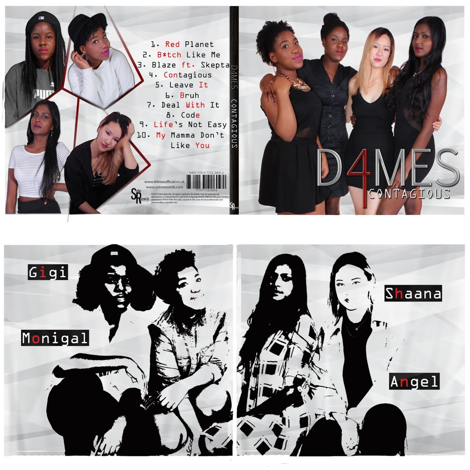
 Below is one of the images shown on our website.

PERSONAL IDENTITY
Everyone in the group get along very well but are at the end of the day individuals who have their unique traits. We've tried to connote this through our scenes with our partners which are all different and give off different vibes. For example mine is tense as me and Mario stare at each other's eyes and get very close while Gigi's is very cute as she is being playful with Eddie.

We also include a bit of info about each of us in the 'Meet The Girls' section of our website.

SURVEILLANCE
Our website is the main text that gratifies audience's needs for information. It informs them of our newest songs/albums merchandise and tours. It also links all our social media sites, has an abundance of photos and even short bio pages on each member of the group. Our Facebook page and Twitter account are the main social media platforms that gratify the audience also for sources of information. What's good about social media sites is that theyr'e constantly updated and are accessible to everyone with the proliferation of technology. They're also highly interactive as users can like and comment on things.
We received a lot of feedback from people of both genders and varied ages. One way in which we received this feedback was through an anonymous survey online. We could link this to anyone who was willing to take it.
This is the anonymous survey that we set up on SurveyMonkey
Results from SurveyMonkey
  • Female respondents made up 82% of the people who took the survey suggesting that they were more interested in our music video which confirmed that our primary target audience were females
  • The genre(s) of our music video were identified correctly by 90% of respondants displaying our success in portraying that genre
  • Main criticisms of the video:
        - "sometimes there are too many flashes or fast cut aways it is too much for the eyes and loses                my focus on what's happening"
  • Main compliments of the video:
        - ''the dance choreography was good, the hair flicks were nice''
        - ''the band looks put together and cool''

Another group of people I got feedback from were family members and personal friends. This gave me viewers of varied ages and opinions from people who did not worry about offending me. Below is an interview I did with my sister Catherine, age 16.
During our editing week, I also got feedback from media students in the years below which I thought would be very constructive seeing as they also took the subject. It was very helpful.
They really liked the video saying it looked sophisticated and professional. They liked the special effects we edited in. Their only criticism were that we had too many cuts and flashes which seemed to be a trending criticism so we took that into consideration and altered our editing accordingly. So it now looks much better.

Evaluation Post 4: How did you use new media technologies in the construction, research, planning and evaluation stages?

Being able to use a wide variety of recent media technologies meant we could complete our project efficiently and creatively when researching, planning, producing and blogging. We made use of both modern software and hardware to create our project to the highest standard.


Research & Planning
Our research was all internet based. Due to the proliferation of the internet and its advancement, google was immensely useful. We could research anything we wanted on the music industry including current popular artists, target audiences and youth culture. Google images and sites such as pinterest were particularly useful in researching fashion and art to inform our clothing choices and hair styles as well as make-up looks for the music video

YouTube
YouTube was really useful for us as we watched countless music videos to inspire ideas for our own on visuals, fashion choices, video effects and even dance routines we could learn. Having access to the Latymermedia account meant we could upload videos onto the shared channel such as tutorials and stealomatics. We could also view previous years' music videos. One particularly useful thing we did was upload a collection of videos that inspired each of us into one playlist so we could collectively view them and know what our other team members were interested in.

Whatsapp
For ease of communication, we created a whatsapp group chat, on which we discussed and shared project matters outside of school. Whatsapp is a hugely popular mobile app that is really simple and convenient to use.

Instagram
We had access to social media via the internet which was essential in communicating with each other to share our research using apps such as Whatsapp and Facebook. The fact that we can access the internet hence these apps on our mobiles meant we had ease of access to information and ease of communication anywhere at any time. It also meant we could see what current artists were up to and how they built their image and promoted their music via Twitter and Instagram. It allowed us to see what they did in their personal lives at home and also their professional lives out. Of course we were able to research artists' marketing campaigns online in order to create our own. We also sourced their fashion styles from google images and Instagram. YouTube is the main platform for viewing music videos worldwide. We watched countless videos to inspire our own ideas in preparation for production which included dance styles, fashion worn in music videos and how they were shot and edited.
Construction
For the contruction of our music video we used the Seward studio at school to our advantage as our shoot location. This meant we had access to the school's studio technology including the lighting system, cameras, tv and sound system. We then used the media department's editing suites for post production. Adobe Premiere Pro was our choice of editing software. Photoshop was our choice of software for creating our album cover and inside. We used Wix to create our website.


Although Wix was mainly easy to navigate and had lots of available functions and features, it was sometimes difficult to use especially as we did not have previous experience with it. One problem was the fact that a lot of the pictures we uploaded were distorted with either heads cut out the frame or legs missing from the bottom.This problem was easily solved by looking up instructions online.
I also used my phone (a Samsung Galaxy S4) to record evidence of our construction stages so I could upload them later onto my blog.

Evaluation
For the evaluation stage I used various web tools one being Blogger to collate my progress. I also used tools such as Slideshare, Padlet and Prezi to present my work. In order to present evidence in visually dynamic ways I used Imgflip to create gifs and publisher to create tables and diagrams. I also used YouTube to upload evidence the group needs such as certain shots and first shoots/edits.
 I used social media sites such as Facebook to interview people for their thoughts.

Sunday 20 December 2015

Construction Post 6: Website post-production

We used Wix, a free cloud-based web development platform that allows users to create HTML5 websites and mobile sites, to create the D4MES music website. We liked Wix as it is simple to use with their online drag and drop tools but also it has a variety of editing functions and features which allowed flexibilty in how we wanted our website to look.

Here are our original flatplans for the website layout:
Firstly we started with a template from the music section and personalized it using a simple black background. Then we created the header with the D4MES logo on top and navigation options below which we made to show on every page the viewer clicked on. Each button on the header is linked to another page. We decided on a red,black and white colour scheme for brand image and consistency. Athough those colours sound more like the colours you would see on a grunge, punk pop band's website, we made it work as the font on our website was simplistic and giving it a classy, RnB vibe.

At first the logo was centered on the header and even larger in size but after we asked for feedback we decided to change it.
Criticisms from teacher feedback:
"A centred header is quite general in style,maybe try something more interesting"
"There's so much empty space around it that could be used"
Crticisms from fellow students and audience members:
"The font is a bit too big - it looks slightly awkward and takes attention away from the main statement images"
Although a centred header is not uncommon, it did not add anything to our website so we placed the header to the side which we thought added to our minimalist, classy vibe instead. We also realised that our website was not interactive enough and could use the space to the right of our header better so we put a subscription option on the right of the page allowing fans to be updated. This is a key convention of artists' websites.

After some thought we decided to create an 'enter site' page as it was a common convention and allowed us to make certain features more prominent such as getting the audience to buy our new album and watch our newest music video.
We filled our homepage, meet the girls page and the gallery page with photos of D4MES to add visual richness and show off our 3 dimensional characters. We also included classic features such as a news and store page where fans can be updated by our live twitter feed and buy merchandise. This is to increase their interactivity with us as a girl group and give them a chance to buy into and be part of our brand and identity. Of course we added social media links at the footer of every page.
Overall the website turned out nicely and we all did our share of the work on it. The only thing that annoyed me was the fact that we had to manually crop pictures to fit either our heads or our legs in as we could not do it on Wix. Everytime we inserted an image it would not be to size. Other than that Wix was generally easy and convenient to use.

Saturday 19 December 2015

Construction Post 5: Digipak post-production

Although we had a flat plan for our album cover and back, the end product differed greatly to what we'd first imagined it to look like. Nevertheless we're happy with how it turned out. The process was very experimental as weren't so sure on how we actually wanted it to look.

For our digipak we decided to use Adobe Phototshop CS5.5 to edit our images and put them together. This worked out really well as most of us already had a lot of experience working with photoshop.

We worked with a digipak template shown below.

  • The green area was allocated to the photo
  • The blue area was allocated for any text spillovers
  • The red line was the 'bleed line' - anything in that area would get cut off during printing
This is a picture of our original flatplan which consisted of us standing against a brick wall and one of the inside covers being an arty geometric design.
Me and Thakshana editing
The hard part was choosing which photos we wanted to use which resulted in our digipak process being very long due to much experimentation.
We wanted to used the photo below at first as we really liked our outfits however the pose did not seem quite right or bold enough for the front cover. We wanted something that made more of a statement.
Thus we changed it to the photo below as it has the professional, classy girl group image that we wanted to portray.

The process of editing our digipak:
1. Using the selection tool and the magic wand we removed any backgrounds.
2. We used the define edge tool to remove any white edged and rough edges around us for example around our hair.
3. We increased or decreased the size of our image using 'show transform' option and placed the image where we wanted it.
4. We would crop anything we didn't want out.
This is the first final draft of our album front cover (above) and inside cover (below). The back cover of our album (top left) surprisingly turned out very similar to our initial plan so we were very happy with it as it worked out to how we first visualised it. However after asking for feedback on our digipak from our target audience group and teachers we realised we needed to make changes to the front and inside.
Positive Feedback:
"I like the consistent colour scheme it's classic but the red keeps it interesting"
"I like what you've done with making some letters red"
Criticisms:
"The background of your inside cover is not nice, it looks very grunge and moody, I don't feel the rnb or pop vibe"
"The inside image of you all looks very washed out so you kind of blend in with the background"
"There's quite a lot of space around you on the front cover, you girls need to fill up more of the frame"
We agreed with the criticisms so decided to improvise and make some changes. Below is me and Thakshana's drafted result of our research on cool Photoshop effects. We wanted to create an inside cover that contrasted the front and made a statement.
However this was not working out well as it did not suit our band image. In the end we decided to use the background of our front cover in order to keep the consistent white and grey theme. We also made the image above black and white as that looked lot cooler and fit in with the monochrome look. Just as we added red letters to the back of our album, we put our star names up with a red letter each. This used the empty space around us effectively. Below is the end result.

Thursday 17 December 2015

Construction Post 4: Music video post production

Having previously used and enjoyed Adobe Premiere Pro CS5.5, we decided again to edit our video using the program.
Above is our edit suite.

PROCESS
1. After importing the clips we wanted to use onto Premiere, we created tracks and copy and pasted over the edited Red Planet song from our test edit and dragged it onto the audio track.
2. Then we started cutting clips and dragging them onto the video tracks. We had to make sure they were synced so that our lips were singing the song perfectly in time to the audio.
3. Then we each put in and edited our own individual shots according to the visual image of what we wanted our own sections to look like in mind
4. We collectively edited the sections of the video featuring scenes of the whole group.

SPECIAL EFFECTS
We proceeded to use special effects such as slow motion, reverse speed, wave warp, fade to blacks, cross section fades, lens flare effect and ProcAmp.


We used the slow motion and reverse speed often in conjunction to create arty scenes such as the balloon and confetti scene below. The balloon popping and confetti falling was originally very fast but we slowed it down by changing the duration of the clip to 200% and then used the same clip again but ticking the reverse option so that it would play backwards giving the illusion of time rewinding.


Feedback from our target audience (a group of young girls) included really liking the flashes in and fast cut aways we currently had so we put more in to make the scenes more dynamic and visually engaging as they were impressed by them. An example of that is also in the clip to the right


We often placed cross section dissolves onto the end of one clip and the start of the next so that the shots transitioned nicely into the next for example in the clip to the right.

This clip also shows the very beginning of our music video which previously started with Thakshana's spotlight shot. However one of our teachers said that it would be more suitable to introduce us as a group and then come in with the individual shots which was a key convention of band music videos. Thus we made our changes accordingly.

Wave warp was an effect I found as an alternative to the old, static TV effect we originally had in mind. It worked well when we introduced a small wave and then a larger one shortly after to build up the dramatic effect. A great example of this is during my verse.


ProcAmp was very useful for grading which was the final step of editing the music video. This meant adjusting the brightness, contrast, hue and saturation of our all our clips.


Another interesting effect we found was the lens flare effect. This added more impact to the laser set up of my scene as it helped to intensify the galaxy/space vibe of my verse. At first this lens flare was static but after watching a tutorial in YouTube I learned how to move the flare in order for it to look more natural as there is camera movement which moves me around in the frame.
Overall I'm very happy with how we edited our music video, we put in so much time and effort which paid off.

Wednesday 16 December 2015

Construction Post 3: Promo shoots

Our timetable for our promo shoots:

Tuesday 7am-12pm
Wednesday 9am-11am
Thursday 4pm-8pm (back-up session)


Our set is to the right. We had extra lighting and the flash feature in order to take the best photos possible.

I think the first promo shoot session went really badly as we had technical difficulties such as the flash on the lights not working which meant most of our pictures turned out really dark. Also the camera was not in focus for a lot of the shots. We didn't check up on our pictures as we were taking them so we didn't realise that at least one of us were unprepared in each picture - we never got ready at the same time to have our picture taken.

Gift doing Monica's hair below.
 Me doing my hair at the vanity table.


Example of one of our bad pictures from the first shoot


The next promo shoot went a lot better. The flash was working and we made sure the camera was in focus. This time we checked our pictures every few shots and also counted down subtly to get ready together, in sync for the pictures. Since me and Monica had the same frees we took each other's individual shots which turned out really nice. We played with props such as a chair which I thought Monica looked quite cool sitting backwards on. However her legs looked slightly awkward in the pictures being spread out so much so we didn't use those but kept them if we wanted to zoom in and tighten the frame as her facial expressions were on point. Monica also shot my picture from low angles to give a more dominant vibe and directed me well telling me which facial expressions looked best.
The classy promo shoot was quite difficult as the poses we tried looked very awkward a lot of the time. We wanted to give off a classy prestige vibe but ended up taking pictures which looked like prom photos or family photos. In the end we went with a simple concept and stood side by side as most girl band album covers feature the same poses. Below are some of the nicer selection of photos from our shoots.